
marathon breath
nyc marathon air + why runners [should] care
In true nyc fashion, the 2024 nyc marathon successfully set out to break the record for largest marathon in the world to date. New York Road Runners (nyrr) sent 55,646 runners through hoards of spectators across nyc’s five boroughs over the course of a cool (borderline cold) November morning.
This is significant traffic. How might this mass of humanity stampeding through the streets have impacted air quality? Might all that vigorous stepping and cheering have kicked up dust? Might this have been hazardous to runners and spectators?
There was only one way to find out. And so, (while we’re on the topic of marathons), I’m popping in to share a mini study I carried out, n = 1 (yours truly) to answer these questions during the 2024 nyc marathon using a small personal air quality sampling device.
For the record, I am *most* interested in exploring the equity implications of air quality: how different living and working conditions shape access (and lack thereof) to the stuff of strong respiratory heath, including clean air. I’ve been able to explore these topics at the cuny School of Public Health with a team focused on occupational and environmental health under the guidance of Dr. Brian Pavilonis.
Our projects have focused on work-related exposure, which — considering most of us spend a third or more of our lives working — is a big deal. I’ve worked with and learned from people working in nail salons, cleaning, and restaurants—people who, due to structural issues in nyc and the us at large, often face disproportionate health hazards and lack the power and position to advocate for their own safety. Exploring the layered socio-structural determinants of exposure to polluted air (work conditions, housing, socioeconomic position, immigration status, etc.) is essential advocacy work.
It was in the midst of a regular research team meeting when a teammate brought a new idea to my attention. They said, and I paraphrase:
“You know who cares about air quality? Runners!”
Our team had been chit-chatting about the upcoming nyc marathon, which two of us would run. You see, beyond large-scale factors shaping exposure to polluted air, individuals within similar contexts (people who share, for example, a workplace or an apartment) are impacted differently. When these contextual variables are held constant, the degree to which air pollution impacts an individual depends on their personal physiological circumstances — both their physical condition and their breathing rate while exposed.
Physical condition aspects might include a person’s age or the presence of underlying conditions like asthma or lung damage. These are conditions shaped over relatively long timeframes, whether stemming from genetics, history of respiratory infections (like covid or tuberculosis), or lifestyle factors like smoking, hanging around lots of smokers, or working in a coal mine (to name a few high-profile lung health topics).
Breathing rate depends in-part on age and other physical conditions, but also on short-term circumstances: what are you doing and how much are you exerting? The pattern is simple: more intense activity means a faster breathing rate, which corresponds with higher exposure to whatever’s in the air. If you think about it, it makes sense: you might take 12 breath cycles per minute while lounging on the couch, speed up to 24 on your panicked fast-walk to catch the train (mental/emotional stress is a form of exertion, too), and to 50 or more when you’re working out. In other words, you get several times more of whatever’s in the air when you’re working out than when you’re lounging on the couch.
This introduces a paradox. The medical community emphasizes the importance of exercising our cardiac abilities — getting our heart rates up — regularly to maintain optimal health. But cardio puts our lungs in a vulnerable position, multiplying the potential destructive impact of air pollution. This is why air quality alerts warn against engaging in physical activity when AQ is low. A chill walk will keep you safer than a jog. And, thanks to breathing rate logic, if you are elderly or have underlying respiratory conditions, your chill walk may expose your lungs to as much destructive air as a jog might expose a young healthy person.
That’s why runners [should] care about air quality.
In our study, we were using the atmotube pro — a tiny air quality sensor (actually a collection of various extra tiny sensors) designed to be worn discretely — to capture the air quality experienced by participants. The atmotube detects and records particulate matter sized 1, 2.5, and 10 micrometers (µg) (pm1, pm2.5, and pm10), volatile organic compounds (vocs), trace gasses like carbon dioxide (CO₂) and nitrogen oxides (NOx), and climate details like temperature and humidity. The atmotube was fun to use. Each of us had been using them to explore our own personal questions, like what’s the air quality on my commute? (depends) or how bad is burning popcorn for my cat’s asthma? (bad) or does vacuuming decrease suspended dust in my apartment? (no) or how effective is my humidifier? (not very)
how might we: marathon mini experiment? (methods)
Thus was borne the idea of wearing an atmotube while running the nyc marathon. I got to work piloting different ways of carrying the little sensor. Several design challenges existed. First, the atmotube was designed to be hung via carabiner to clothing. This would be quite annoying while running. Furthermore, the atmotube needs to face a specific direction: it has little air input holes on one side only, and if those are covered or pressed against clothing or skin, results are not accurate. If I didn’t design an alternate way of carrying it while running, it would swing around chaotically, driving me mad and compromising the accuracy of measures.
I tried stuffing it into my visor strap on a long run. Stable, but very uncomfy for my head. I tried securing it in my shorts’ compression pocket with the air input holes sticking out. It sunk into the pocket within just a few steps. I tried holding it in my hand. This quickly proved far from ideal on a longer run; it was both annoying and subjected to the influence of contact with sweat.
A colleague suggested trying a phone arm band, in which I could cut holes to expose the atmotube’s input area, if needed. This idea got me on track. Before buying and wearing something new, I decided to sew a custom pocket onto my compressive running shorts. I used a double layer of old stockings, and sewed the sensor tightly into place to ensure perfectly exposed intake holes and zero bounce. I took this set up on a shakeout jog with great success: I couldn’t feel the atmotube’s presence at all, and it stayed securely in place.
Marathon morning came. The sensor was fully charged up and connected to my also fully charged phone (required for linking to gps) upon starting the race. And luckily, despite bluetooth failing between my watch and my headphones at several points on the course (presumably due to traffic on the bluetooth waves), my gps data proved pristine.
Over the course of the 4-hour run, the atmotube sucked in air and sent info about it to my phone, which recorded each minute’s data alongside gps coordinates. After obligatory pizza, beer, and sleep, I exported the data from my phone to a .csv file and imported it to a favorite nyc basemap in qgis, which I had created previously. I then used q to explore different ways of mapping the various aq metrics.
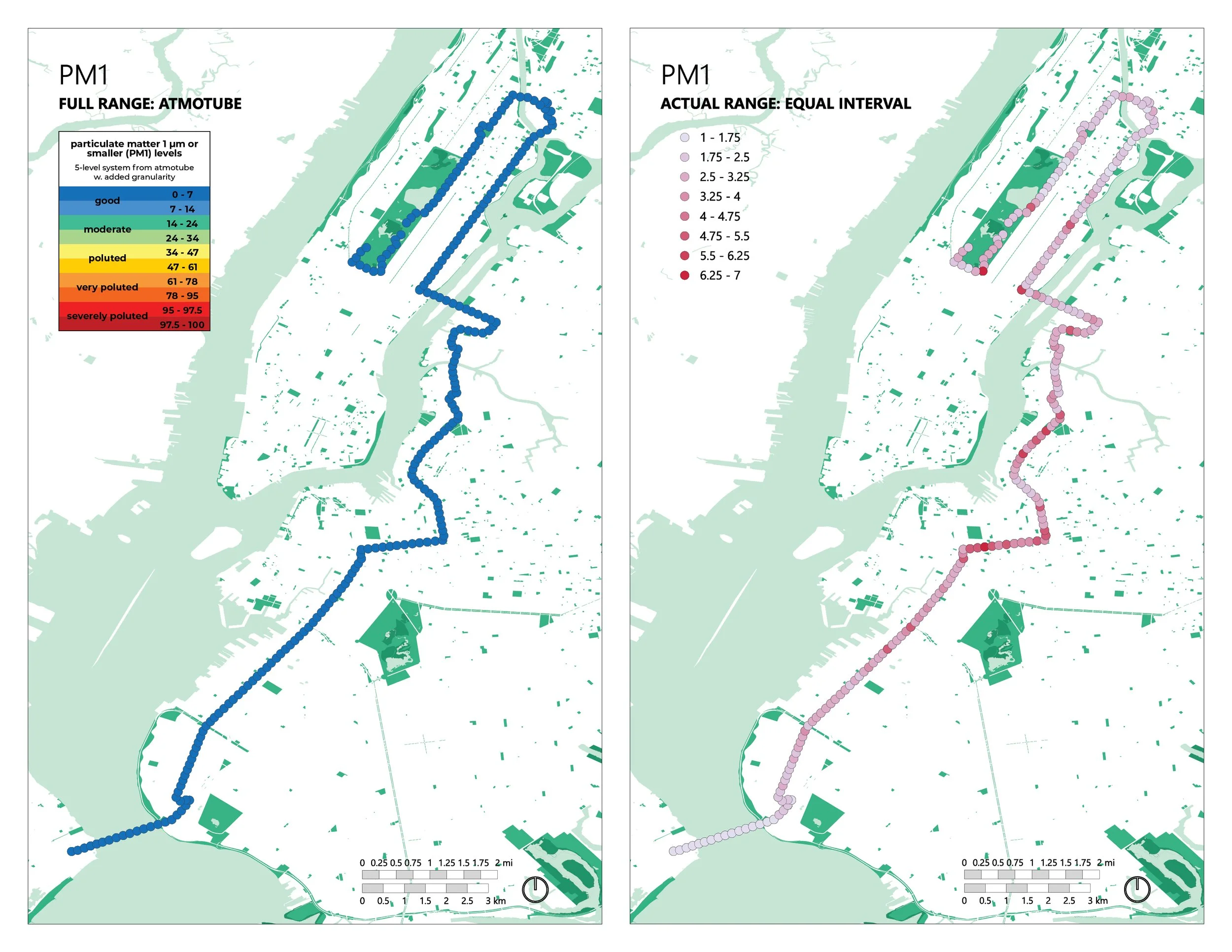
It quickly became clear that I would need two ways of looking at each aq metric: one that shows the range of detected levels and one that contextualizes this range. This is because the data did not cover the full range of possible levels. For example, the atmotube can measure pm1 ranging from 0 to 100 micrograms per cubic meter (µg/m3), where 0 is clean and 100 is severely polluted. But my marathon data for pm1 ranged only from 1 to 7 (the levels were quite low). Showing these data within the full range communicates that pm1 levels were overall low, but may miss important variations that displaying the data with more granularity can facilitate.
For this reason, I built two maps for each air quality metric: one that shows the range of levels detected and one that puts that range into the full spectrum of possible levels. In the former, the range of captured levels is divided into equal intervals (e.g. for pm1, the range of 1 to 7 is divided into 8 levels, each spanning a range of 0.75 µg). The latter uses a rainbow color scheme to communicate levels on the spectrum from “good” to “severely polluted,” which I built referencing atmotube’s threshold tables. Displaying the data in both ways enables us both to see the variability of levels across the course and to understand those levels in the grand scheme of human health implications. If this is confusing, keep reading.
what did we breathe? (Results)
The results, overall, showed that air quality was good on the marathon course. More granular views of the data, however, show interesting variations that may provide valuable insight into air quality management in massive running events. Let’s dive in.
particulate matter
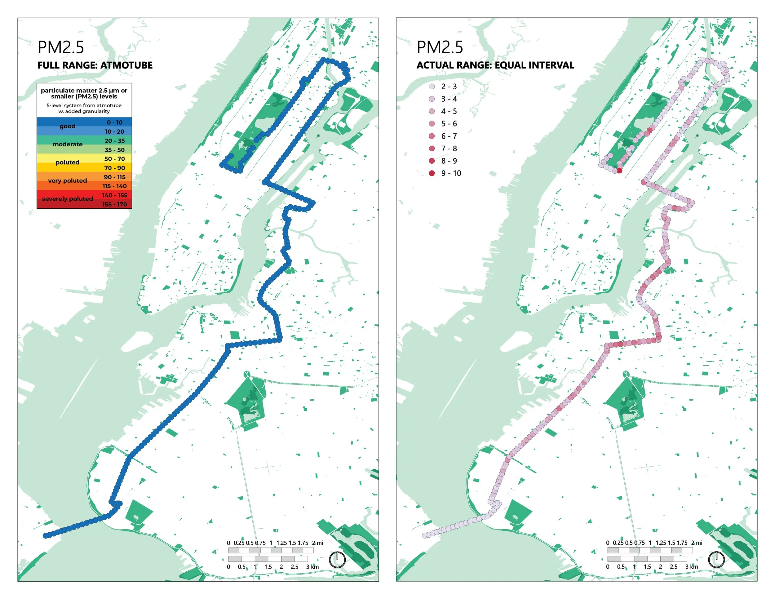
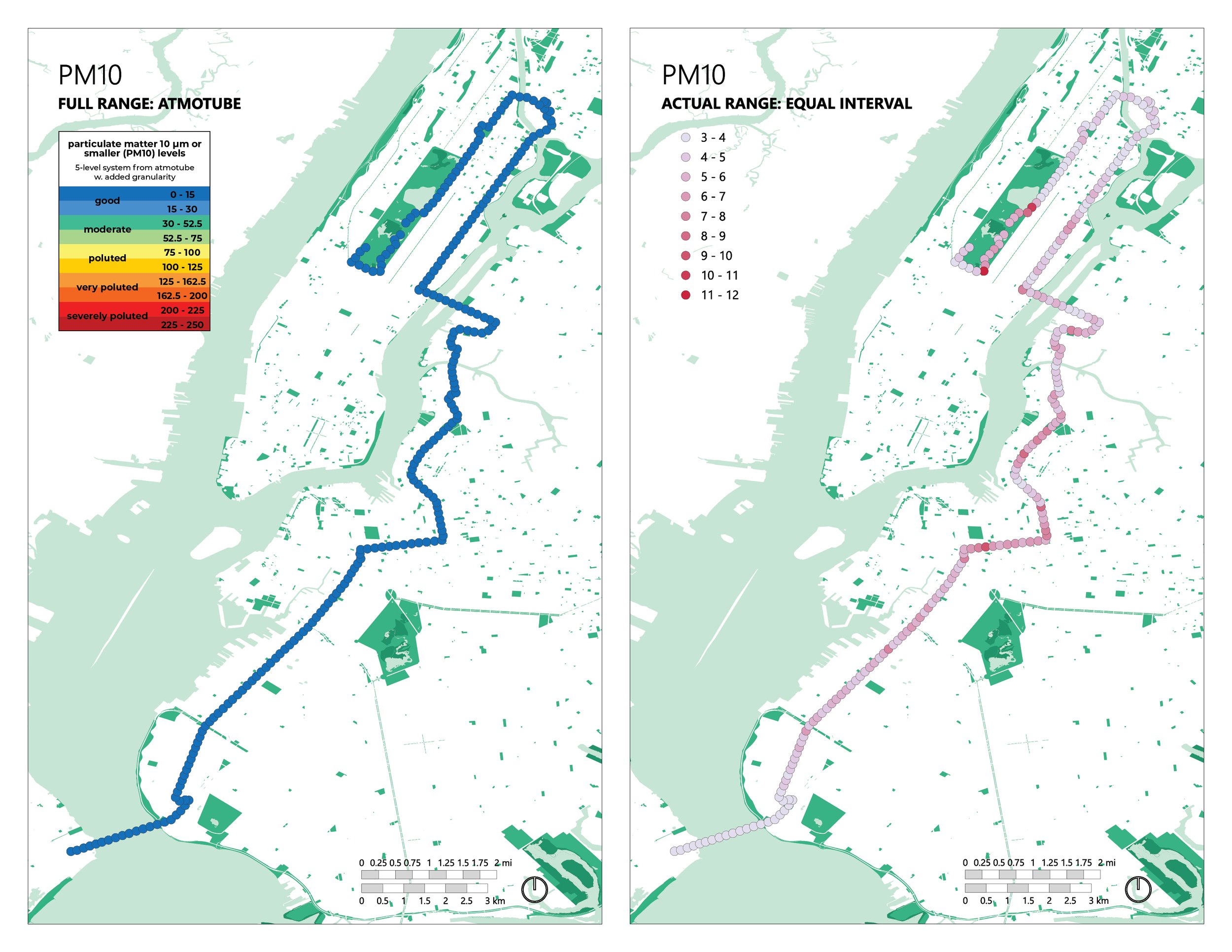
The first set of maps below displays results for pm1, pm2.5 and pm10. For each, there are two maps: one subtitled full range: atmotube, with a rainbow legend and another subtitled actual range: equal interval, with a dusty pink-red legend. The full range maps display results in the context of a range of levels from “good” to “severely polluted.” As you can see, levels for each of the three sizes of pm yield dark blue (rather than green, yellow, orange, or red) dots, indicating the lowest, most health-supporting levels of pm.
The actual range maps display something more interesting, in my opinion. They show variation on the marathon course, with darker red dots indicating higher pm levels. Sure, these higher levels are still low in the grand scheme of possible levels. And they provide insight into what conditions might lead to suspended particulate matter. Examining these maps, I notice a few corners where levels are relatively high, as well as the section of the course that passes through Brooklyn, which happens to feel most full of rowdy spectators! There’s also a line across Manhattan (level with the bottom of the reservoir) with elevated pm. Why might this be?
When we view the data with such granularity, we get to speculate as to why these spikes may occur. This can lead to insights into how pm behaves in the context of a massive marathon. Should levels ever reach “polluted” status, these insights may prove quite valuable in efforts toward mitigating pm, which, as discussed above, matters a great deal for people engaging elevated breathing rates (e.g. runners, elderly striders, rowdy spectators).
Volatile organic compounds
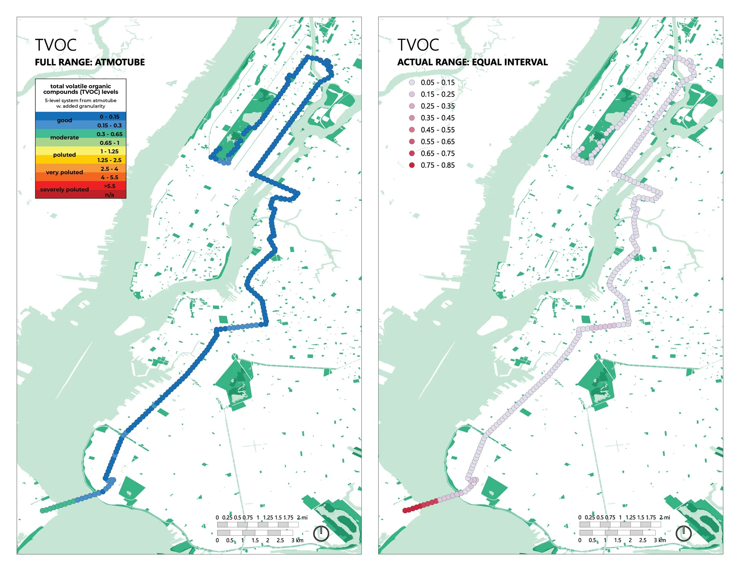
Volatile organic compounds are carbon-based chemicals that easily evaporate into the air at room temp. They are emitted as gases from thousands of common products and are a primary cause of poor indoor air quality and, outdoors, contribute to the formation of smog — harmful air pollution caused by a mixture of smoke, fog, and chemical fumes. The maps below show total volatile organic compounds (TVOCs) across the marathon course. Unlike pm, when mapped in the context of the full range of possible levels, tvocs did not land entirely in dark blue! The area around the start of the marathon, extending about half-way across the verrazzano bridge, is rendered in dark green, signifying only moderate quality. Furthermore, a section in brooklyn and the southeast corner of central park turn up in lighter blue, signifying that levels landed at the less good end of “good.”
The actual range map with the dusty pink-red legend provides more detail. It tells us all tvoc levels landed in 0.1 ppm intervals ranging from 0.05-0.15 to 0.75-0.85. The extent to which each of the two map styles communicates variation provides insight on its own. Unlike the pm data, for which, in my opinion, the actual range maps are more striking, tvocs appear more interesting when rendered on the full range map. The relatively high contrast between the highest tvoc levels and the rest effectively washes the granularity from the actual range map. And because the tvoc data fall within a relatively wide range of levels, the full range map is able to convey nuanced variation, unlike the pm data, which yield monotone dark blue full range maps).
Data visualization musings aside, the question remains: why were tvocs elevated around the marathon start? Might there have been an abundance of fumes emitted from the buses used to transport runners from the ferry to the start? Might there have been an abundance of fumes emitted from ferry traffic? What about all the helicopters looming around the start? Might runners have included an abundance of aerosol products (e.g. muscle sprays, deodorants, hair spray, spray-on sunscreen, scented products) in their prep routines? Certainly a combination of factors may have contributed.
air quality score
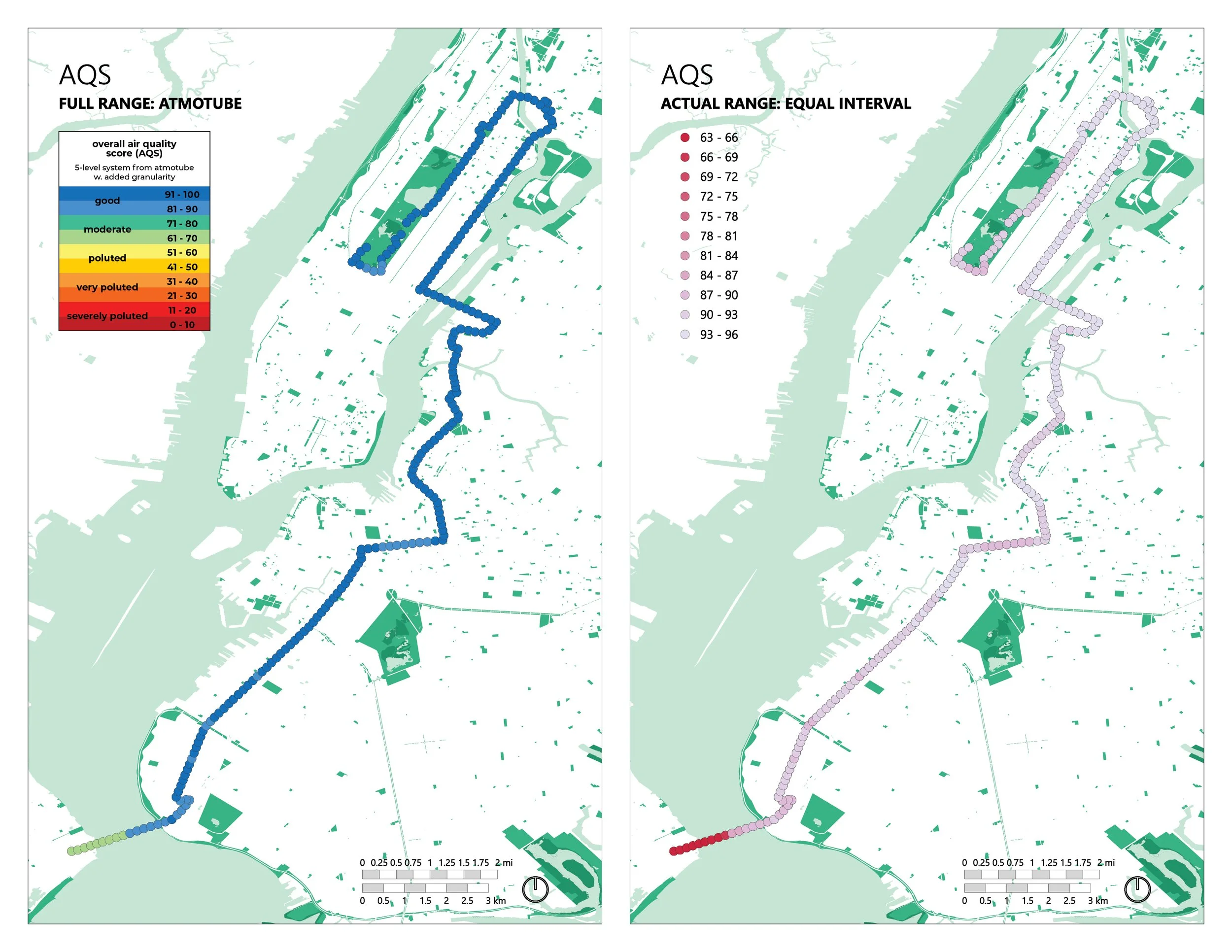
Atmotube provides an overall air quality score (aqs). This is their proprietary metric that aggregates data from the atmotube’s multiple sensors (pm, voc, other trace gases) into a single, digestible number. Unlike pm or voc levels, which are measured in micrometers per cubic meter and parts per million, respectively, atmotube’s overall aqs ranges from 0 (severely polluted) to 100 (very clean) and is unitless. Whereas we want pm and voc levels to be low, we want our aqs to be high. Think of it as a test score: 100% is a+ and 0% is beyond failing.
Our overall aqs maps show that, all things considered, overall air quality was mostly good over the course of the marathon, with the exception of the marathon start, where the aqs is at the low end of moderate. That the aqs is lower at the marathon start than seems possible due to measured voc levels (which are not that bad) and pm levels (which are impeccably low) suggests that something else — perhaps trace gasses like carbon dioxide (CO₂) and nitrogen oxides (NOx) — may have contributed to the relatively low aqs. To know, I’d have to map and analyze those specific metrics; a possible task for my future self.
in context
Of course none of this means much without comparing the air quality along the marathon course with the air quality of nyc at large. According to iqair, the air quality in nyc that day was good, with some dips into moderate depending on place and time. The marathon air quality basically mirrored what was going on in the city at large. All things considered, I’m happy to conclude that nyc marathon participants were not at disproportional risk of experiencing adverse effects from the air quality on the course. The marathon aq seems to have depended more on the surrounding conditions than the activity of 55,656 runners and thousands of spectators. I guess I’ll have to do this again to increase my sample size.
